Sunday, May 31, 2015

Styles of Drawing


I was thinking the other day about all the different drawing aides we teach kids in art class: drawing with shapes, negative shapes, turning your paper upside down, measuring with your pencil extended, knowing average proportions, the grid method etc. etc.  Why do we have so many tricks for drawing? Shouldn't there be just one way that is the best way to draw? Of course not. Some of these methods work really well for some people and others don't. Or one trick works really well for certain jobs. I think identifying the type of drawer you are naturally could help when choosing which tricks work best for you. & of course noticing a child's tendencies when drawing could help you pinpoint the method that would help them make a better drawing.

So what type of drawer are you?


The No Consequences drawer - This drawer does NO preliminaries and starts right with a contour line. They work fast, but love detailed wavy lines, and get surprised when the contour line doesn't meet up in the right place when they go back around. I think this type of drawer would benefit from learning to draw a general shape first to get proportions right. Then they can do what they like, detailed contour lines, but following the shape that they have already worked out is the right size for the job. Looking for axes would also help the no consequence drawer. Every once in a while looking to see where a contour feature should line up with something else previously drawn. Maybe even adding some of those measuring axes first would be helpful. Actually anything that makes them pause and see the whole system of what they are drawing would be helpful. I would also like to teach them how to use their pencil to find angles.

The Measurer - The Measurer likes to get everything set out before they start the drawing. They look at all the objects no matter the subject and they plot out where everything lines up, how close they are, then they set off to draw. They may even pull out a ruler as they like straight lines. When they learn how to use their pencil to measure and find angles they were in love. The measurer would benefit from learning to look at the negative shapes and the forms of the objects. After plotting things out like they like I would ask them to swith and look at the negative shapes and see if the they are as perfect as they appear in their drawing. I think they would also benefit from doing some exercises in only form using charcoal. If this is you and you want to try that exercise:  Tint your whole page grey by smearing in the charcoal. Erase out your highlights and add in the shadows with dark black charcoal. It is okay to do this on top of a detailed, measured

The Adjuster - The Adjuster draws by getting something down quickly and easily without distractions then uses their tools to fix it. They tend to use up a lot of erasers and draws with a sketchy broken line. Sketchy lines is just a way to alter the direction of the line as you go. So the adjuster draws slow and is watching the object as they go, continually adjusting the line. After the object is drawn then they adjust more when looking at it as whole and erases and changes things. When a new object is put in, they may even further adjust that first object if it doesn't work with the second object. The Adjusters would benefit greatly by doing some preliminary work like the No Consequences drawer. Creating plumb lines, working out proportions first, etc. The hardest thing for an Adjuster is helping them find a time when to stop adjusting and to like their drawing.

The Shape Shifter - The Shape Shifters love the drawing with shapes method. When exposed to charcoal instead of pencils they were in their glory, and fell in love with pulling out highlights and rubbing in shadows. Shape shifters would benefit from learning where and when to use sharp or soft lines as their work could end up with only soft edges. Also they would benefit greatly from switching their mode of thinking every once in a while to negative shapes to see if they have things lining up right.

Like any list of "types" noone fits into only one of these categories. Knowing that everyone does not struggle in the same way could really help you help your kids draw better as well as yourself!

Wednesday, May 27, 2015

John Ruskin Elements of Drawing 1857 - the search for the origins of the modern elements and principles of art

John Ruskin Elements of Drawing 1857 - the search for the origins of the modern elements and principles of art 

As I said in my last post I am trying to find the earliest example of the elements and principles of art. I want to know who authored them and why and how they evolved into what they are.

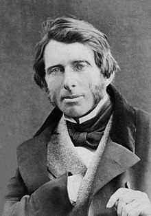
My first book I am reviewing in this quest (yes, I just went there) is John Ruskin's Elements of Drawing. John Ruskin is an English Victorian art critic. His fame started with his published work Modern Painters in 1843 in which he defends the artist Turner.

John Ruskin 1863.jpg 

 This book is really three separate letters that were written to the beginning drawing student. He actually says the book and it's exercises are not for children under the age of 12-14.  The first two letters are for improving drawing landscapes from life. They are filled with exercises with perception as the main focus, but always with nature in mind. Along with drawing trees, he has lessons on drawing shades in drapery and dead white porcelain objects. In the first letters he seems fixated on shade over line, often mentioning the great artists of chiaroscuro. Along with shading he talks about drawing delicately. A term that he interprets a few times in different contexts but to me always seemed to fall back on not rushing or trying to be bold.

These are some great quotes from these first two letters:

"There is no merit in doing wrong easily."
"Nearly all expression of form, in drawing, depends on your power of gradating delicately."
"For nature is made up of roundnesses., not the roundness of perfect globes, but of various curved surfaces."
"Everything you can see in Nature is seen only so far as it is lighter or darker than the things about it, or of a different color of them."


The last letter is the meaty one in so far as the elements and principles go. He starts off the letter on the use of colour, always apologizing about how he can't have color examples in the book. There are some great tips in there as well.

Then he goes into composition. As he puts it, "Composition means, literally and simply, putting several things together, so as to make one thing out of them; the nature of goodness of which they all have a share in producing."

He also, however, adds "It is impossible to give rules which enable you to compose. You might more easily receive rules to enable you to be witty." & "The essence of composition has precisely in the fact of its being unteachable."

Of course he then lays out his 8 laws of composition!

1. Principality: "One feature shall be more important than the rest, and the others shall group with it in subordinate positions." So quite simply, have a focal point that the other elements support 
2. Repetition: Echoing a feature to create unity,  
3. Continuity: (I love this one) "Giving some orderly succession to a number of objects more or less similar." His examples are: Columns going off into perspective, and clouds fading into the distance getting both softer and smaller. He adds "If there is no change at all in the shape or size of objects; there is no continuity; there is only repetition - monotony.  
4. Curvature: "All beautiful objects are terminated by delicately curved lines, except when needs for stability." He refers to curvature in both individual objects, like in the quote, as well as objects in a composition ending or lining up in a curve.  
5. Radiation: Things radiating out from a point. Often with the point far off the page. "Enforcing unison of action in arising form, or proceeding to, some given point, the most influential in producing the beauty of groups of form."  
6. Contrast: Composing two things of opposition next to each other be it line, color, value. "Rest can only be enjoyed after labour; light is exhibited by darkness."  
7. Interchange: The UNITY of opposite things. This refers not to things that are opposite lying next to each other, but uniting two objects by interchanging a characteristic. For example adding the tint of a dominant item into the other subordinate item.  
8. Harmony: "if you change one thing in the system of nature - you must change them all to match the new system." He talks about this with an eye to nature or painting what you see. If you are painting a landscape and make one color  in it more saturated than what you see in life, then you have to add saturation to the whole composition. 

His laws of composition are not too different than our principles of art:

Ruskin's list is just so good, I wonder if he is borrowing from someone else that I haven't found yet. If you know of any such list let me know. He does mention Samuel Prout's book: Hints on Light and Shadow, Composition &c. so I did read that as well. It is a much shorter text that mainly revolves around him giving what I would call tips along with beautiful visual plates. Things like: triangular compositions are pleasing, use the 2/3, 3/5, or 4/9 rule of light and dark, and avoid equal quantities of contrast. Although he is an amazing artist and has some great tips there is nothing that resembles a list of any sort. 

Ruskin's list is so perfect it makes me hope it is the first of it's kind and the one that others drew upon. He is such an enjoyable writer, and so impassioned about what he talks about I highly recommend you reading it yourself. One thing that I learned is, that if he is the first, he did not write the laws expecting to use them to create a good composition. More that the laws are evident in good work. Also he is mostly focusing on landscapes and creating and finding good compositions in Nature. 

here is the link to this book on google books: http://bit.ly/1FbVWhd
or on Amazon if you wish a hard copy: http://www.amazon.com/The-Elements-Drawing-John-Ruskin/dp/1453842640

The History of the Elements and Principles of Art


The History of the Elements and Principles of Art

In a conversation with my husband who is in higher ed, I looked up the wiki for the elements and principles of art (design) in an effort to find out who originally wrote them. Surprisingly, the article does not have that information. Just a couple of lists and definitions and citing to recent texts.

I have now been making an effort to find this information out to possibly update the wiki, but also to help me understand what the original intent of the elements and principles was. I bet that knowing the origins of them will help me understand the best way to use them in the classroom.

So far, these are the texts I have found that I need to read. I will be adding blog posts reviewing each and seeing if they lead me to any others.


1857  -  Elements of Drawing by John Ruskin (stones of Venice)

1900 - Line & Form by Walter Crane

1920 - Composition: Understanding Line, Notan & Color

Sunday, May 17, 2015

Cereal Designers

Third Grade  

Cereal Designers
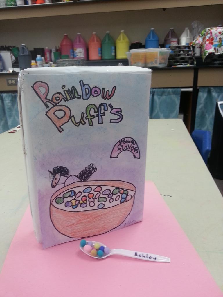
Third graders got to try out two art professions with this project: Food designers and Package Designers. Food designers design the aesthetics of food to make it more pleasurable to look at and eat. The kids used Model Magic clay to create bite sized cereal with unique shapes, color and texture. Next they took on the role of package designer and created a box that sells their cereal. They dissected two cereal boxes to learn what was needed on a cereal box which included a bowl, the cereal, a character, a call-out, and a title.

I knew this project would be fun, but I was really surprised how much the students enjoyed it. One boy in particular who usually doesn't finish art projects to completion made 3 cereal box ideas! I think it was because so much of it was about the idea over execution.  

I split the lesson up into 2 parts:

The first was designing the cereal. I had the kids shape 3-4 bite-sized pieces with model magic focusing on: size, color, shape, and texture. 

The second part was the cereal package designs. We looked at two cereal boxes and compared and contrasted them to make a list of what was important on our boxes. With guidance we decided on having: a bowl, a character, a call-out, and a fancy title. The first day working on the boxes we drew our bowls, out character and the call-out. The second day we finished that up, added pastel rubbed in backgrounds, and  and added the title. We found we needed a 3rd day to finish properly. 


Embedded image permalink

Displaying 20150518_135446.jpg

Displaying 20150518_135434.jpg

Displaying 20150518_135303.jpg

Friday, May 8, 2015

Starry Night

Every Art teacher does some sort of Starry Night right? I try to switch between painting and heavy drawing projects (for my own sanity) so the kinders were ready for painting after designing super awesome cars. Here's how I do Starry night with kinders.

I start out with a Mati and Dada video on Van Gogh. I don't have any time between classes, one goes out one comes in, so the video is a good way to let me set up for the kindergartners. Plus they really relate to the video that talking alone doesn't do. If you haven't seen these videos, they are 7 minutes long and are about a little girl who loves art and just happens to have a robot who can go back in time to take Mati to see her favorite artists.

After the video, I show "my favorite" Vincent Van Gogh painting - Starry Night. I ask only one simple question to the kids and have them talk about the answer with partners and then pick kids to share their answer. I ask them "What is the weather like in the painting and how can you tell?" Such a simple question and they always come up with a windy cold night and talk about the lines and colors.

Next we start painting. I split it into two days. We paint the blue backgrounds the one day with swirly strokes. Then we use marker caps to make about 5 circles evenly across the page. I show them how to make swirls starting at the stamped circles with white paint. I know this will be a hard concept for some kinders so I also give them the option to make concentric circles (something we have used before successfully). Hello differentiation. The kids on the top chose to make the harder swirls and the kids on the bottom made concentric circles.


The second day we added the black and yellow bits. I decided to make it a starry night in our own town of Woodland. For discussion we compared the town where Starry Night is to our own town in Washington. We start the 2nd part of the painting with a black  wavy line (a common vocabulary in my room) for the hills. We added houses on the hills if we wanted to. Then I show them a simple way to make pine trees using some brushstroke skills. Last we add neon yellow paint (that pops) using short lines or dots on top of the White swirls.


Displaying 20150507_155648.jpg