I just found an excellent series on teaching creativity from the Iowa State University CELT department. http://www.celt.iastate.edu/teaching-resources/classroom-practice/teaching-techniques-strategies/creativity/
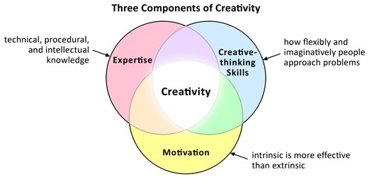
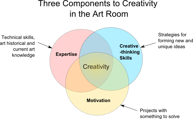
If we think about this specifically for the visual arts there are three separate components that we need to teach in the art room.
We need to teach students creative thinking skills.
We need projects or topics to motivate and cultivate ideas for.
We need to develop students' expertise in the visual arts, which includes: skills to create meaningful art, and some context of what has been done before and what is going on now in the art world.
The world is asking for a different kind of worker or citizen in the increasingly changing world of technology we live in. The first attribute every business says that they need from their employees is someone who is creative. Like when the workforce needed a new type of employee during the industrial revolution art educators are stepping in and saying "Hey we DO that, we teach students to be CREATIVE! We are important!" but are you doing that in your art room? Are you teaching them what it means to be creative, not only in a visual art context, but in a way that can be utilized in other disciplines?
Let's look at the definitions of creativity.
Creativity definition by Merrian Webster:
: having or showing an ability to make new things or think of new ideas
: using the ability to make or think of new things : involving the process by which new ideas, stories, etc., are created
: done in an unusual and often dishonest way
What businesses are talking about when they talk about a creative work force? I think they are talking more about the second definition: using the ability to make or think of new things: involving the process by which new ideas, stories, etc., are created.
Creativity has a magical following. Most people think that people like Picasso, and Einstein must just have an amazing brain that pops out creative ideas. Put an artist in an environment that is open and they can have choices and they will be creative. It is something we have and it will just come out if we give the opportunity. & that is how I've seen it in the art room. Art teachers ask students to come up with ideas and even grade them on their "creativity" without actually teaching them methods to hone their creativity and come up with new ideas. Ideas are not created in a vacuum. What is the problem needing to be solved, what are some solutions others have come up with, what are the limitations, what are the skills that we can exploit? Then the brainstorming can begin (that we also need to teach students how to do), art production, and reflection.
Every Creative Solution Starts With a Problem to Solve
Students need to be confronted with a problem to be able to create a solution. If you just tell them to make something new and be creative without parameters they will create substandard work. Not because they are lazy, but because they don't know where to start. Coming up with something creative and new requires having the context and knowledge of what has been done before and what questions need to be solved. That is what projects are for. To create a question for the student to answer using the abilities they have and can put their creative efforts towards. Limitations help drive the creative process, not stunt it. Limitations are similar to situations in the real world. Scientists have to create new ways to acquire energy with the limited resources and the limited technology we have. The real creativity is being able to combine the things we can do despite the limitations and to eventually overcome them through knowledge and experimentation. The question of how to create cheap sustainable energy has created huge strides in wind and solar power in the last decade. Without the question needing to be answered these technologies wouldn't have advanced.
For an art education example in this post, the problem to be solved will be creating a poster that creates an awareness for an animal that is in danger of extinction.
Research
After confronting students with a problem the creative journey requires some context and research. If the problem you have asked your students to solve is creating an artwork to bring an awareness of an animal that is on the near extinction list, then you need to start with research to define the problem better. You need to give them the context of how an artist or two solved a similar problem. Show them two examples by two different artists. Make a list of what things are present in both posters. Add to the list things that are different in the two posters. This further defines the problem and will give students a direction to create something new.
Teaching them Brainstorming
Don't just ask the kids to come up with ideas or to make 4 possible sketches. Teach them how to brainstorm! Choose either one method like mindmapping and always use that or teach them other methods as well. Create lists or play a game with the kids around the table. Make them aware that this is something that they can use elsewhere not just a fun game they did in art class. Brainstorming is a learned skill, not an inherent ability. This is how we teach creativity. We give them methods to do it. After they brainstormed ideas and things related to their animal and the the knowledge of other artist's solution to the problem (the examples they looked at) then they can make their thumbnail sketches.
Limitations & Skills
The limitations in the art room would be what skills the students come to the table with and what supplies can be used as well as the initial problem to be solved. This is where teaching media skills comes in. Teach them a skill you want to be seen in the final poster. Maybe you showed them examples of two posters made in watercolor and then you teach them skills needed to do their own in watercolor: masking, washes, color mixing. This is not limiting their creativity. This is focusing their creativity by using the skills they learned to solve a problem.
Art Production
Finally time to get out the art supplies! They have their idea plotted out that is as new to the world as they could get with the research they have done and their brainstorming method. Now they can use the art technique skills of watercolor you taught them in your demo to create an original artwork. Often kids will ask if they can use techniques not learned as well and my answer is almost always yes as long as they display the ones they learned too. If I taught them how to make a wash there should be a wash in there somewhere to be the assessment for the skill learned. This will not limit their creativity, but actually push it because they will have to come up with a solution that takes into account that limitation. Working for companies on creative projects has taught me that there will always be limitations artists have to work inside. When I was hired to create an image for a colored pencil tin I was told it needed to use their colored pencils as the medium, had to show the vibrance of the colored pencils, and had to have fruit and fabric in the design. I had to use my creativity in those confines to make the best image I could.
Reflection
Either in the middle of the production, or at the end, have the students reflect on the how effective their solution was. Not on how well they could use watercolor or stay inside the lines. It will take years of practice in art to perfect techniques. They should reflect on how well their image gets across the point they were trying to make. If you do this before the project has to be finished it will still give them time to make changes before being graded. What you really want is for them to put into words their process and their understanding of their creative process.
I've heard people say you can't teach kids creativity and I completely disagree. Teaching them tools and techniques to focus their brains on creating new ideas is teachable and should be part of their art education.
Monday, June 29, 2015
The Search for Elements and Principles Continued
I have gotten a little further in my search for the beginnings of the elements and principles in art education. I contacted the big guys, the National Art Education Association, through their website and asked if they knew who wrote the first real list of the elements and principles. I thought for sure they would just know this and give me a date when the NAEA adopted them as their suggested standards. Instead she told me to read the work of Mary Ann Stankiewicz especially her book Roots of Art Education Practice, which is a part of the Davis Publication the Art Education in Practice Series. I purchased a used copy and have really enjoyed reading it, but it still didn't tell me exactly what I wanted to know - just part of it.
The book is really insightful laying out the history of art education, especially the who's and why's of it. I really recommend reading it if you are an art educator and especially if you are interested in the purpose of art education today. Looking into the reasons people thought an art education was important in the past really makes you question why it is important today. When art education started in the late 19th century there were ulterior motives of course: educating people to be able to do design work in the new industrial age, raising up the middle and lower classes to the morals and tastes of the upper classes, and even to create a beautiful uncluttered school setting. There were different segments with different ideas, but the elements and principles seem to come from a group of upperclassmen who were guiding much of the progress of art education: Walter Smith, John Ruskin, Henry Turner Bailey, Arthur Wesley Dow, Denman Waldo Ross , Louis Prang (Art Teaching Manual), Mark Hopkins, Joseph Torrey. Mary Ann Stankiewicz describes Hopkins and Torrey's thoughts thus: "As Hopkins explained, cultivating one mental power would tend to strengthen the rest. Similarly, cultivating sound aesthetic judgement among the better classes could improve the national taste, providing a supportive environment for American Art."
The elements and principles of art were a way for these upper-class men to find a system in the art from Western and other origins that was teachable to their schools and also the middle class. The elements and principles for some had ties to music principles and others literature.
Here are the three major people she talks about in chapter 5. She also talks about the beginning of color theory and schools but since they don't seem tied to any lists of elements and principles of art per se, I am going to leave them out here.
Louis Prang art textbooks: line, mass, color chief element. (page 89) value was kept to three shades light, dark, middle value. Influenced by Dow
Arthur Wesley Dow: line, notan (dark & light), color Dow criticized the separation of representational art and decorative art. Influenced by Japanese art.
Denman Waldo Ross: taught elite men of Harvard, focus on "scientific methods to understanding and explaining art and artistic elements and principles. "Tones (value and color), measures (the size and area of each tone), and shapes were the elements of 2-d design." (page 95)
She does mention Ruskin who had a much more solidified list in that time of the principles of art, but does not list his list or talk about him much which confuses me. Here is a link to my post about him and here is the list of his principles: Principality, Repetition, Continuity, Curvature, Radiation, Contrast, Interchange, Harmony. For an explanation of these principles click here.
So I know the roots of the elements and principles, but I still don't know where our solidified list comes from. I I have a feeling it is from NAEA itself, but that is just a feeling. If anyone knows when THE LIST was written and why let me know!
The page numbers in this post refer to pages in Roots of Art Education Practice by Mary Ann Stankiewicz.
We focus on learning primary and secondary colors in kindergarten and leave the color wheel until 1st grade. I absolutely LOVE this video for mixing colors by Scratch Garden The song is catchy and the kids love the weird imagery. They also talk about warm and cool colors which I don't think kinder is ready for yet.
We do a simple worksheet the first day to make color math problems. We do one row at a time and they get a sticker if they get the row right!
Next we do 2 projects with color mixing and I play that Scratch Garden video at the beginning of every class of the unit to get it stuck in their head!
The first assignment is a simple crown inspired by a story my family and I wrote about a king who loved purple (below) We paint cyan and magenta paint in stripes, daubs etc. on a 6x8 piece of paper and let it dry. The next week we fold the paper in half and make a zig-zag line (vocab from line/shape unit) across and cut while folded to get a crown. Then add some holes and glitter for jewels.
I have also done this project as a full portrait which was cute. It just depends on how much time you have.
For the other secondary colors we make a simple shield. We cut it out of 12 x 18 paper folded in half again and paint the entire thing yellow. While it is still wet, we mix in orange in 2 quadrants and blue in the other two quadrants, leaving shapes if we want. This would be great on a thicker card stock if you have it, with a handle on the back.
Here's the story my children , husband and I wrote for the color unit!!
The King Who Loved Purple
Once upon a time in a land far away there was a kingdom where people were happy and had all the things they needed.
The King in this land had a favorite color: purple. He thought it was the perfect color. Why would you have any other color except purple?
He loved it so much that one day he decided that he didn’t want anything in his kingdom that wasn’t purple. His servant hung signs all around the kingdom and knocked on doors telling people to throw away anything that wasn’t purple.
When the day came people threw away so many things.
They threw away red cups, blue bowls, beige computers, and pink polka-dotted sweaters.
They threw away black computers, yellow iPods, and plaid lampshades.
They even threw away the King’s lemon-meringue-striped rainbow-checkered pajamas. Everything would not be perfect until all non-purple colors were removed!
As he was walking through his kingdom looking at everything people were throwing away he saw an old painter throwing away his paints. The painter was sad, but squirted his red paint and his blue paint in the garbage can.
But when the two paints mixed together in the can, something amazing happened. They turned into purple!
“Wait,” said the King to the painter. “How is that possible? Why did that happen?”
The painter looked at him, puzzled. “Don’t you know that purple is just red and blue mixed together?”
The King hadn’t known this, and thought about it a minute. “So, if I like purple, I really like red and blue in a way?”
“Of course.” said the painter. “You can’t have purple without red and blue. Besides, if everything is one color, then purple won’t be as special anymore.”
The king thought long and hard about this. He sort of missed his red cups, and his blue bowls. And he even missed the other colors too -- the pink iPods and the plaid lampshades. And he especially missed his lemon-meringue-striped rainbow-checkered pajamas.
The King looked at the painter. “So if we have red and blue, we can make purple any time we want?”
“Absolutely,” said the painter.
“Well,” the king said, “I suppose given that other colors make purple, it might be okay to a have a FEW things that aren’t purple…”
And so the people took back their red cups, and blue bowls. They reattached their plaid lampshades, and put back on pink-polka-dotted sweaters. And everything was the same again, except for maybe the king, who sat with the painter in his living room, mixing red and blue paints together happily and painting big purple sunsets.
While, of course, wearing his lemon-meringue-striped rainbow-checkered pajamas.
I am switching to Middle School next year and am passing my lessons down to the new primary school teacher for her to use (or not use) so I thought since I am writing them up I should put them on the blog. I'll be adding them one at a time or a unit at a time.
This is the 1st unit I do with with kindergarten, so it is pretty simple at first. The goal is to introduce them to the vocabulary they will need to draw: describing and drawing lines and shapes. We have a large ESL population so it is especially important to establish common words for the art room.
The first project is lines: straight, slanted, curved, wavy, loopy, zig-zag. This is a common project. We start out the day with reading Lines That Wiggle by Candace Whitman. We then draw in crayon lines across the page. This is a guided lesson and all the kids have to make each type of line, but not in the same spot. The next part is describing what a shape is: a line that closes on itself. We then paint inside the shapes with watercolor. Might as well get the paint out for the first project right?!
The second lesson in the unit we learn about geometric shapes that have names. I show them Kandinsky's Circles and how there is one shape inside the other. We get out the tempera and paint shapes inside of shapes. I also allow them to add lines and dots in between. It is such a simple project but they turn out really pretty. Just don't give them all the colors of paint! This is still the first month of school and for many the very first time they have gotten to use messy tempera paint!
This is the final picture of the unit. The other two projects are very simple and a way to introduce vocabulary needed for this drawing. I explain that we are going to draw a pig (from If You Give A Pig a Pancake) using the lines and shapes we have learned. We use circles, triangles, curved lines, straight lines, and dots. Every time I do this so early in the year for a kindergartner, I am amazed at how well they do! They also enjoy making different foods for their piggy to eat!
I was thinking the other day about all the different drawing aides we teach kids in art class: drawing with shapes, negative shapes, turning your paper upside down, measuring with your pencil extended, knowing average proportions, the grid method etc. etc. Why do we have so many tricks for drawing? Shouldn't there be just one way that is the best way to draw? Of course not. Some of these methods work really well for some people and others don't. Or one trick works really well for certain jobs. I think identifying the type of drawer you are naturally could help when choosing which tricks work best for you. & of course noticing a child's tendencies when drawing could help you pinpoint the method that would help them make a better drawing.
So what type of drawer are you?
The No Consequences drawer - This drawer does NO preliminaries and starts right with a contour line. They work fast, but love detailed wavy lines, and get surprised when the contour line doesn't meet up in the right place when they go back around. I think this type of drawer would benefit from learning to draw a general shape first to get proportions right. Then they can do what they like, detailed contour lines, but following the shape that they have already worked out is the right size for the job. Looking for axes would also help the no consequence drawer. Every once in a while looking to see where a contour feature should line up with something else previously drawn. Maybe even adding some of those measuring axes first would be helpful. Actually anything that makes them pause and see the whole system of what they are drawing would be helpful. I would also like to teach them how to use their pencil to find angles.
The Measurer - The Measurer likes to get everything set out before they start the drawing. They look at all the objects no matter the subject and they plot out where everything lines up, how close they are, then they set off to draw. They may even pull out a ruler as they like straight lines. When they learn how to use their pencil to measure and find angles they were in love. The measurer would benefit from learning to look at the negative shapes and the forms of the objects. After plotting things out like they like I would ask them to swith and look at the negative shapes and see if the they are as perfect as they appear in their drawing. I think they would also benefit from doing some exercises in only form using charcoal. If this is you and you want to try that exercise: Tint your whole page grey by smearing in the charcoal. Erase out your highlights and add in the shadows with dark black charcoal. It is okay to do this on top of a detailed, measured
The Adjuster - The Adjuster draws by getting something down quickly and easily without distractions then uses their tools to fix it. They tend to use up a lot of erasers and draws with a sketchy broken line. Sketchy lines is just a way to alter the direction of the line as you go. So the adjuster draws slow and is watching the object as they go, continually adjusting the line. After the object is drawn then they adjust more when looking at it as whole and erases and changes things. When a new object is put in, they may even further adjust that first object if it doesn't work with the second object. The Adjusters would benefit greatly by doing some preliminary work like the No Consequences drawer. Creating plumb lines, working out proportions first, etc. The hardest thing for an Adjuster is helping them find a time when to stop adjusting and to like their drawing.
The Shape Shifter - The Shape Shifters love the drawing with shapes method. When exposed to charcoal instead of pencils they were in their glory, and fell in love with pulling out highlights and rubbing in shadows. Shape shifters would benefit from learning where and when to use sharp or soft lines as their work could end up with only soft edges. Also they would benefit greatly from switching their mode of thinking every once in a while to negative shapes to see if they have things lining up right.
Like any list of "types" noone fits into only one of these categories. Knowing that everyone does not struggle in the same way could really help you help your kids draw better as well as yourself!
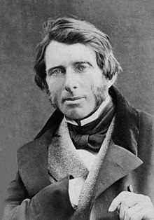
John Ruskin Elements of Drawing 1857 - the search for the origins of the modern elements and principles of art
As I said in my last post I am trying to find the earliest example of the elements and principles of art. I want to know who authored them and why and how they evolved into what they are.
My first book I am reviewing in this quest (yes, I just went there) is John Ruskin's Elements of Drawing. John Ruskin is an English Victorian art critic. His fame started with his published work Modern Painters in 1843 in which he defends the artist Turner.
This book is really three separate letters that were written to the beginning drawing student. He actually says the book and it's exercises are not for children under the age of 12-14. The first two letters are for improving drawing landscapes from life. They are filled with exercises with perception as the main focus, but always with nature in mind. Along with drawing trees, he has lessons on drawing shades in drapery and dead white porcelain objects. In the first letters he seems fixated on shade over line, often mentioning the great artists of chiaroscuro. Along with shading he talks about drawing delicately. A term that he interprets a few times in different contexts but to me always seemed to fall back on not rushing or trying to be bold.
These are some great quotes from these first two letters:
"There is no merit in doing wrong easily."
"Nearly all expression of form, in drawing, depends on your power of gradating delicately."
"For nature is made up of roundnesses., not the roundness of perfect globes, but of various curved surfaces."
"Everything you can see in Nature is seen only so far as it is lighter or darker than the things about it, or of a different color of them."
The last letter is the meaty one in so far as the elements and principles go. He starts off the letter on the use of colour, always apologizing about how he can't have color examples in the book. There are some great tips in there as well.
Then he goes into composition. As he puts it, "Composition means, literally and simply, putting several things together, so as to make one thing out of them; the nature of goodness of which they all have a share in producing."
He also, however, adds "It is impossible to give rules which enable you to compose. You might more easily receive rules to enable you to be witty." & "The essence of composition has precisely in the fact of its being unteachable."
Of course he then lays out his 8 laws of composition!
1. Principality: "One feature shall be more important than the rest, and the others shall group with it in subordinate positions." So quite simply, have a focal point that the other elements support
2. Repetition: Echoing a feature to create unity,
3. Continuity: (I love this one) "Giving some orderly succession to a number of objects more or less similar." His examples are: Columns going off into perspective, and clouds fading into the distance getting both softer and smaller. He adds "If there is no change at all in the shape or size of objects; there is no continuity; there is only repetition - monotony.
4. Curvature: "All beautiful objects are terminated by delicately curved lines, except when needs for stability." He refers to curvature in both individual objects, like in the quote, as well as objects in a composition ending or lining up in a curve.
5. Radiation: Things radiating out from a point. Often with the point far off the page. "Enforcing unison of action in arising form, or proceeding to, some given point, the most influential in producing the beauty of groups of form."
6. Contrast: Composing two things of opposition next to each other be it line, color, value. "Rest can only be enjoyed after labour; light is exhibited by darkness."
7. Interchange: The UNITY of opposite things. This refers not to things that are opposite lying next to each other, but uniting two objects by interchanging a characteristic. For example adding the tint of a dominant item into the other subordinate item.
8. Harmony: "if you change one thing in the system of nature - you must change them all to match the new system." He talks about this with an eye to nature or painting what you see. If you are painting a landscape and make one color in it more saturated than what you see in life, then you have to add saturation to the whole composition.
His laws of composition are not too different than our principles of art:
Ruskin's list is just so good, I wonder if he is borrowing from someone else that I haven't found yet. If you know of any such list let me know. He does mention Samuel Prout's book: Hints on Light and Shadow, Composition &c. so I did read that as well. It is a much shorter text that mainly revolves around him giving what I would call tips along with beautiful visual plates. Things like: triangular compositions are pleasing, use the 2/3, 3/5, or 4/9 rule of light and dark, and avoid equal quantities of contrast. Although he is an amazing artist and has some great tips there is nothing that resembles a list of any sort.
Ruskin's list is so perfect it makes me hope it is the first of it's kind and the one that others drew upon. He is such an enjoyable writer, and so impassioned about what he talks about I highly recommend you reading it yourself. One thing that I learned is, that if he is the first, he did not write the laws expecting to use them to create a good composition. More that the laws are evident in good work. Also he is mostly focusing on landscapes and creating and finding good compositions in Nature.
In a conversation with my husband who is in higher ed, I looked up the wiki for the elements and principles of art (design) in an effort to find out who originally wrote them. Surprisingly, the article does not have that information. Just a couple of lists and definitions and citing to recent texts.
I have now been making an effort to find this information out to possibly update the wiki, but also to help me understand what the original intent of the elements and principles was. I bet that knowing the origins of them will help me understand the best way to use them in the classroom.
So far, these are the texts I have found that I need to read. I will be adding blog posts reviewing each and seeing if they lead me to any others.
1857 - Elements of Drawing by John Ruskin (stones of Venice)
1900 - Line & Form by Walter Crane
1920 - Composition: Understanding Line, Notan & Color
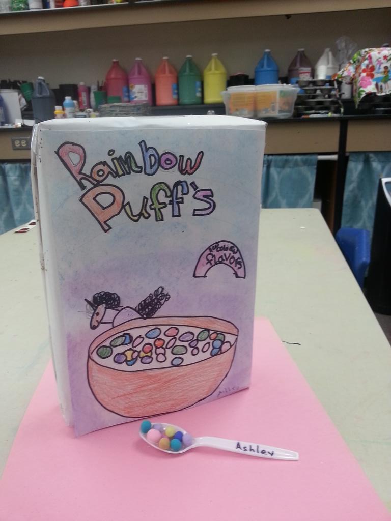
Third graders got to try out two art professions with this project:
Food designers and Package Designers. Food designers design the aesthetics of
food to make it more pleasurable to look at and eat. The kids used Model Magic
clay to create bite sized cereal with unique shapes, color and texture. Next
they took on the role of package designer and created a box that sells their
cereal. They dissected two cereal boxes to learn what was needed on a cereal
box which included a bowl, the cereal, a character, a call-out, and a title.
I knew this project would be fun, but I was really surprised how much the students enjoyed it. One boy in particular who usually doesn't finish art projects to completion made 3 cereal box ideas! I think it was because so much of it was about the idea over execution. I split the lesson up into 2 parts: The first was designing the cereal. I had the kids shape 3-4 bite-sized pieces with model magic focusing on: size, color, shape, and texture. The second part was the cereal package designs. We looked at two cereal boxes and compared and contrasted them to make a list of what was important on our boxes. With guidance we decided on having: a bowl, a character, a call-out, and a fancy title. The first day working on the boxes we drew our bowls, out character and the call-out. The second day we finished that up, added pastel rubbed in backgrounds, and and added the title. We found we needed a 3rd day to finish properly.
Every Art teacher does some sort of Starry Night right? I try to switch between painting and heavy drawing projects (for my own sanity) so the kinders were ready for painting after designing super awesome cars. Here's how I do Starry night with kinders.
I start out with a Mati and Dada video on Van Gogh. I don't have any time between classes, one goes out one comes in, so the video is a good way to let me set up for the kindergartners. Plus they really relate to the video that talking alone doesn't do. If you haven't seen these videos, they are 7 minutes long and are about a little girl who loves art and just happens to have a robot who can go back in time to take Mati to see her favorite artists.
After the video, I show "my favorite" Vincent Van Gogh painting - Starry Night. I ask only one simple question to the kids and have them talk about the answer with partners and then pick kids to share their answer. I ask them "What is the weather like in the painting and how can you tell?" Such a simple question and they always come up with a windy cold night and talk about the lines and colors.
Next we start painting. I split it into two days. We paint the blue backgrounds the one day with swirly strokes. Then we use marker caps to make about 5 circles evenly across the page. I show them how to make swirls starting at the stamped circles with white paint. I know this will be a hard concept for some kinders so I also give them the option to make concentric circles (something we have used before successfully). Hello differentiation. The kids on the top chose to make the harder swirls and the kids on the bottom made concentric circles.
The second day we added the black and yellow bits. I decided to make it a starry night in our own town of Woodland. For discussion we compared the town where Starry Night is to our own town in Washington. We start the 2nd part of the painting with a black wavy line (a common vocabulary in my room) for the hills. We added houses on the hills if we wanted to. Then I show them a simple way to make pine trees using some brushstroke skills. Last we add neon yellow paint (that pops) using short lines or dots on top of the White swirls.
On some projects and in some cases I allow kids to use templates or stencils for certain shapes. I know that using templates in the art room is not a popular thing to do (or even the dirty little secret of some art teachers); here are some reasons to keep them around the primary art room.
If you didn't teach how to do it right or well...
If I am teaching a lesson to young kids on say, where to place the features on the head, I don't have time to also teach them how to draw a good oval or egg shape. My class is only 45 minutes plus for elementary you have to limit the amount of instructions to what they can hold in their head. If you have them freehand the oval, inevitably someone or a table full in the class will spend their whole 25 minutes trying to make that initial shape PERFECT. If the lesson is not on how to draw face shapes, then we shouldn't hold them accountable for drawing it freehand if it gives them stress. I mean it is stressing them out because they were not taught how to draw an oval easily and correctly.
Which brings me to...
What you might like aesthetically may not be what the kids like: Alice Neel vs. Vermeer
Robbie Tillotson, 1973 by Alice Neel
You might like that misshapen asymmetrical look of an oval drawn by a child, but the kids see it as a flaw. In their heads they want things precise around the time of 2nd grade up (some of them). You can try and talk them into embracing the beautiful wonkiness of their line (like Picasso loves) but they will leave feeling like they just can't draw and you, the teacher, dooesn't get it. In your head you want the playfulness of an Alice Neel portrait and they want the precision of Vermeer! If the lesson is on creating fluid, freeform lines, don't use one, if the lesson is on something else, then why does it have to conform to your aesthetics instead of theirs?
Straight Edges or Templates - what's the difference
Have you let kids use rulers to create a straight line when needed? What is the difference between that and an ellipse template?
Guaranteeing a size or position
Sometimes you need a young child to draw the FIRST shape a certain size. You explain how to do it and 90% make it the right size but 10% will always need to restart from the beginning. If you don't catch it right away that can really upset a young artist.
Professionals use them
I am also a still-life artist and my work is realistic. If I am doing a still-life and the ellipse on a cup is off, it will throw the whole aspect of realism off. So if I have redone one several times and it still feels wrong I will get out an ellipse template. I learned about ellipse templates in art school and later in a workshop with another professional artist.
If you want to teach how to draw a good ellipse or oval - here is a great tutorial I found by Mike Sibley. http://www.sibleyfineart.com/tutorial--draw-ellipses.htm
or buy some of these from Dick Blick for your classroom for when you don't have time to teach everything.
Sometimes it is the simplest projects the kids have the most fun with. The ones that give them a lot of choices.
We were inspired by the book Hamster Hot Rod by Cynthis Lord, illustrated by Derek Anderson. It is an adorable book, very sing songy. It is about a hamster who wants to enter a car race, but needs a race car. The book goes through decisions on how design his car. The kids really enjoy it and they start thinking about their decisions on their own car at every page.
(I need to warn you not to google the name of that book. Apparently there are rated x pics that use the same key words. If you want to see it go to amazon and look it up!)
I start out teaching them howto draw a car in a few different ways. All of the examples start with a basic rectangle and two circles. Then they need to decide on a shape for their front end, a shape for the back end, and accessories. I don't make them choose what I showed them, but it helps get their ideas flowing by seeing a few ways to do it. I do however make them all start with the basic rectagle and wheels as the basis and have templates for just those shapes for them to trace around that way they all end up roughly the same size and since we will be adding onto the rectangle to make the shape of the car the templates won't deter their creativity.
Below, some student examples of day one of the assignment. We will work on it one more day and add wheels that spin with brass fasteners, cut it out, and some sort of bling (yet to be determined).
Using blacklights to create a buzz in the art room and a presentation goal at the end
Like it or not visual arts sometimes needs a gimmick to get the community pumped about going to see an art show. School music shows and theater don't have that problem. People always want to see their kid in action, but with visual arts the action is already finished in the classroom.
I decided this year to have the kids create an art show centered around blacklights. The kids spent the entire month working on artwork, backdrops, and advertisements in the dark to get themselves and their families excited about the show at the end of the month (which coincided with conferences). The results: a magical show that created quite a few "Whoas" and "Ahs!"
The Supplies
What Glows Under UV
I decided to make the show into a theme of a garden so all of my activities stemmed from that idea with a few exceptions.
The first step was to figure out what materials glow under a blacklight. I started with testing things I apready had in my room and then went shopping to test for more. Some things glow more than others. The best materials I found were:
Crayola Fluorescent Tempera (blue doesn't glow but can be mixed with red and yellow)
Walmart Fluorescent Tempera (including blue)
Highlighters (most yellows, some pink and orange)
Neon Sharpies
Crayola Extreme Colored Pencils
Neon colored pipecleaners and puff balls
Neon ribbon
The Blacklights
I didn't purchase glow in the dark paints. I used blacklights to make fluorescent things glow. The glow in the dark paints do however glow under a blacklight, but they are more pricey. There are two choices for blacklights whichI used a combination of.
1. Blacklight lightbulbs (from Home Depot or Walmart). These work really well together, but the downside is they get hot. They work well for spotlighting the show. They cost $5 each.
2. Strip Lights. These stay cool and give even light. Great for kids testing their artwork and drawing in front of. I paid $20 on ebay for mine.
Painting in the Dark
I really wanted the kids to experience painting with glowing materials in the dark. We tried a few ways of doing it.
1. When they were already working on their artwork I would turn out the lights and put on the blacklights for a couple minutes at a time. The kids really enjoyed this but of course lost focus on their paintings.
2. When the lights were on the kids could test their artwork to see how it glowed at 2 test stations on either side of the room. The paint glows so well that even with the lights on they could see it glow if it was near the light.
3. The day of the exhibition since I had the room cleared of furniture, I passed on art boards, paper and highlighters and we played some drawing games.
The Projects
Kindergarten Flowers
The green stem is actually yellow highlighter that glows light green. The blue around the flower is the white paper showing.
One 2nd grade class made more sophisticated flowers learning how to blend colors on the petals.
3rd Grade Lizards
2nd Grade Frogs with patterns on the belly
3rd Grade Negative Portraits.
We started with black paper and painted the faces and the backgrounds with fluorescent paint.
3rd Grade Positive Portraits.
This class made portraits on white paper and put them on a black background.
2nd Grade Snails
1st Grade Turtles
3rd Grade Owls on black paper with glow background.
1st Grade Shootong Stars
The Exhibition
Below are the 4 walls of the exhibition. I decided to not display the art in the traditional grid style but instead to create backdrops or landscapes that the art lived in. The decision was partly due to how many kids I had in the school (580) as well as wanting to create a full experience for the kids that are K-3rd grade.
Paper Panel Walls
To create a gallery in my classroom I had to erect butcher block walls on two sides of the room attached to the ceiling grids. The paper walls hid my desk, cabinets and countertops. I took my tables out of the classroom for the week of the show. I added duct tape to the top of the butcher paper that I could pierce my grid clips through and attach right to the gridwork. To make the bottom display straight I folded over the bottom edge and stapled it to create a pocket for a yard stick to slide into.
Here is the wall finished. You might notice that the paper is white in the sky area but on the photo with the blaclight it appears blue. Some white paper will glow blue under blacklights which worked perfectly for our sky.
Hands-On Activities
As part of the show I had stations with hands-on activities. On the counter on one side of my room I had science information about blacklights and several examples of things that glow with a black light that people at the show could touch and move.
From Nature:
Rocks from nature (I purchased on ebay)
Feathers
Glowfish (real GMO fish from Petco that glow)
Manmade:
Paints
Highlighters
Stickers, Pipecleaners etc
Tonic Water
I also put a flashlight out for people to see what colors the paint was when we painted in white light. I explained why this phenomenon happens in class with a Power Point presentation and printed out the slides and displayed them for the show. Here is the link to the slideshow.
Counter with hands-on activities.
Edit: Now that the show is over I keep on finding more things that glow! Here's one I've tested. You can mix in highlighter marker into Model Magic! That opens more 3D options!